Understanding Grocery Shopping Payments
A few years ago, I was very fortunate enough to obtain transaction-level online grocery store data from a family friend who is employed at an Asian online grocery delivery company that services mainly the East Coast of the U.S. At the time, I was pursuing my PhD in Marketing and saw this as a perfect opportunity for a research paper. Naturally, I was curious about consumer shopping patterns, particularly in online grocery shopping, which saw significant growth during the Covid-19 pandemic.
Introduction
Given the nature of this data, I wanted to explore how different factors influence consumer behavior. For instance, many consumers own both a smartphone and a laptop/PC giving them the flexibility to choose which device to use for purchases. Does the device type impact spending amount or the products purchased? Anecdotally, making purchases on a phone feels more spontaneous compared to a laptop/PC, which in the context of groceries might lead to more smaller purchases.
Another factor to consider in online grocery shopping is the payment method. Virtually every online store offers multiple payment options at checkout: customers can typically pay using a credit card, prepaid card, or digital wallet. Could these payment methods affect spending behavior and the types of products purchased? Existing research in consumer psychology suggests it could, driven by two mechanisms: payment transparency and payment coupling.
- Payment transparency refers to the visibility of the payment’s form and amount. When payment is more transparent (like using cash), people experience a greater “pain of paying”, which usually discourages spending. Credit cards, by contrast, have lower transparency since the payment is more abstract.
- Payment coupling refers to the temporal link between payment and consumption. With cash, the payment and consumption are tightly linked, but with credit cards, the payment is decoupled—delayed until the credit card bill arrives at the end of each month. This delay reduces the “pain of paying”, which can encourage spending.
In theory, one might predict that since credit cards are less transparent and decoupled, customers may spend more when using credit cards compared to other forms of payment. As a result, I should expect that online grocery orders paid with credit cards will have a higher bill than other payment methods.
Let’s analyze the data and see if these hypotheses hold true! This project will be organized as follows: I’ll begin by describing and exploring the data, followed by a discussion of the results and takeaways.
Data
I obtained two transaction-level sales datasets. The first dataset contains 591,140 orders made by 57,077 unique customers for the year 2021. Each observation in this dataset contains a customer’s ID, their order number, the order date, the delivery date, the status of delivery, the total cost of the order, the payment method, the geographical region in the U.S., and the membership status. The second dataset contains 1,765,641 products made by 31,778 unique customers from the months February, April, and May of 2021. Each observation in the second dataset contains a product purchased by a customer, the customer ID, the associated order number, the order date, the delivery date, the quantity of the product purchased, the price of the product, the product category, and the U.S. geographical region.
I merged the two datasets by matching customer IDs and order numbers to create a dataset at the order or “shopping cart” level. To do this, I aggregated the columns of each order from the first dataset, allowing me to consolidate each customer’s shopping cart for the same variables present in the order-level dataset. I then excluded orders in which the delivery status was not completed (as some orders were refunded or canceled). Furthermore, I excluded orders of which the shopping cart cost was less than $1 because such transactions aren’t very meaningful in this analysis (I don’t have a good explanation as to why there are transactions less than $2 in the data but my best guess is that the company had some filler charges to customers?). As a result, the final dataset for analysis contains 109,010 orders made by 29,592 unique customers. Below is a table that reports some summary statistics of the data.
| Number of Orders | 109,010 |
| Number of Unique Customers | 29,592 |
| Average Order Cost ($) | 80.59 |
| SD Order Cost ($) | 67.63 |
| Min Order Cost ($) | 1.01 |
| Max Order Cost ($) | 1799.42 |
| Average Number of Items in Order | 13 |
| Average Variety of Product Categories (out of 6) in Order | 3 |
Exploring the Data
Since I’m interested in device type and payment method, I’ll examine how these factors affect key outcomes like spending amount, purchase quantity, and purchase variety. These outcomes either weren’t accurate or directly included in the dataset, so I engineered them as new features. Spending amount or Order cost was calculated as the quantity * price for each product for each order in the dataset. Order quantity was calculated as the total number of products in each order. Order variety was measured as the count of distinct product categories in the cart, with a maximum of 6 possible categories.
Let’s take a quick look at each outcome variable. We’ll start with the order cost. We’ve already seen the average order cost from the table above, so I’ll plot the distribution of the order cost.
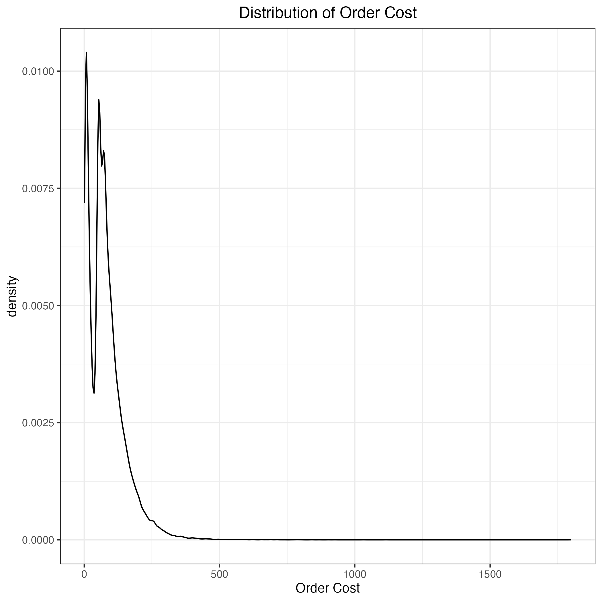
We can see that the distribution is not normal, so let’s apply a log transformation on this variable.
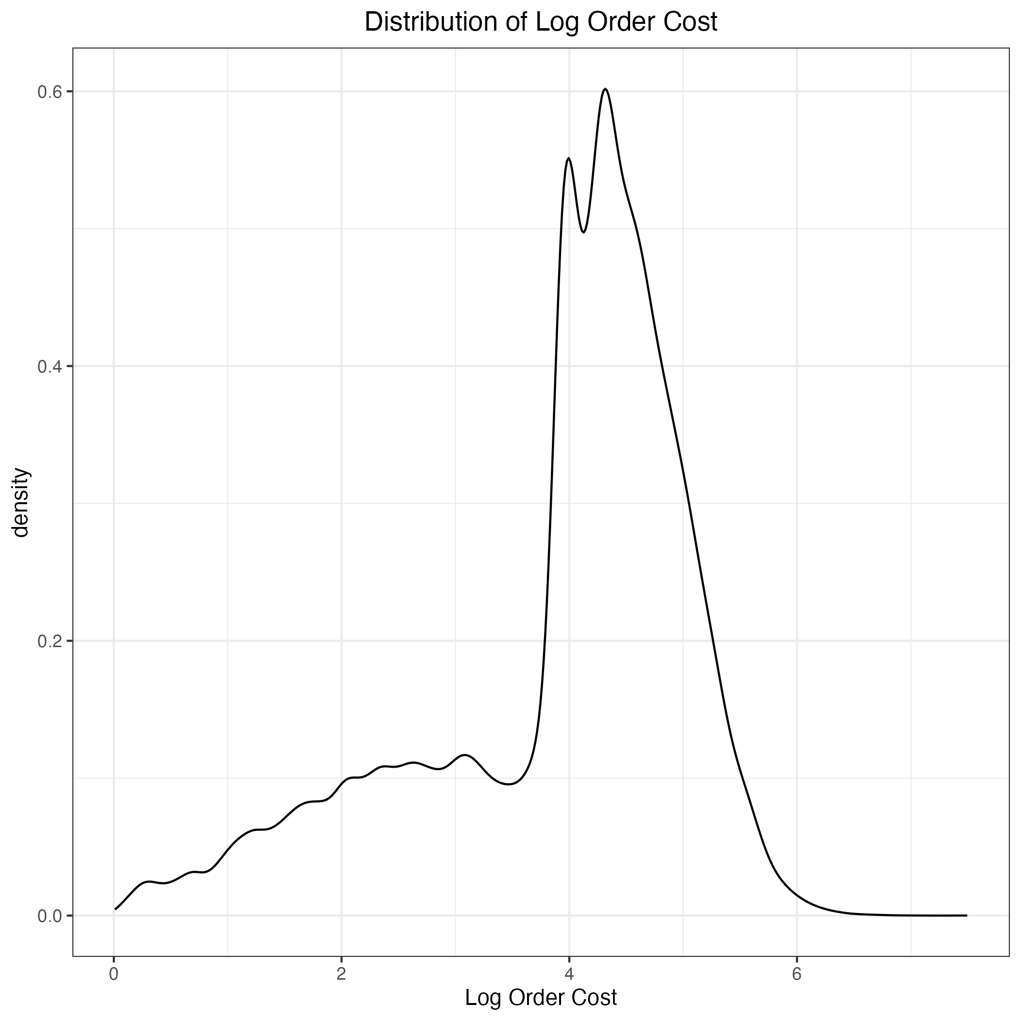
It seems like the log transformation made it more normally distributed. We’ll keep that for now. Let’s move onto the purchase quantity. I’ll also plot the distribution below.
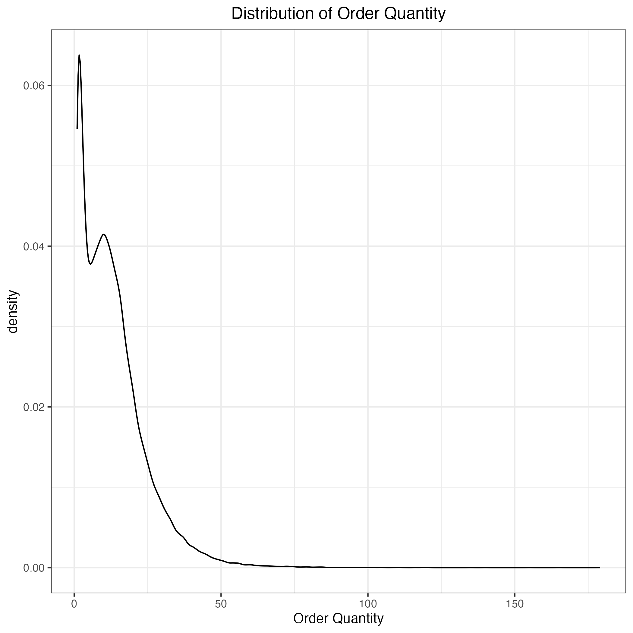
The distribution is heavily skewed with a long right tail. We can also try applying a log transformation to see if it helps normalize the data.
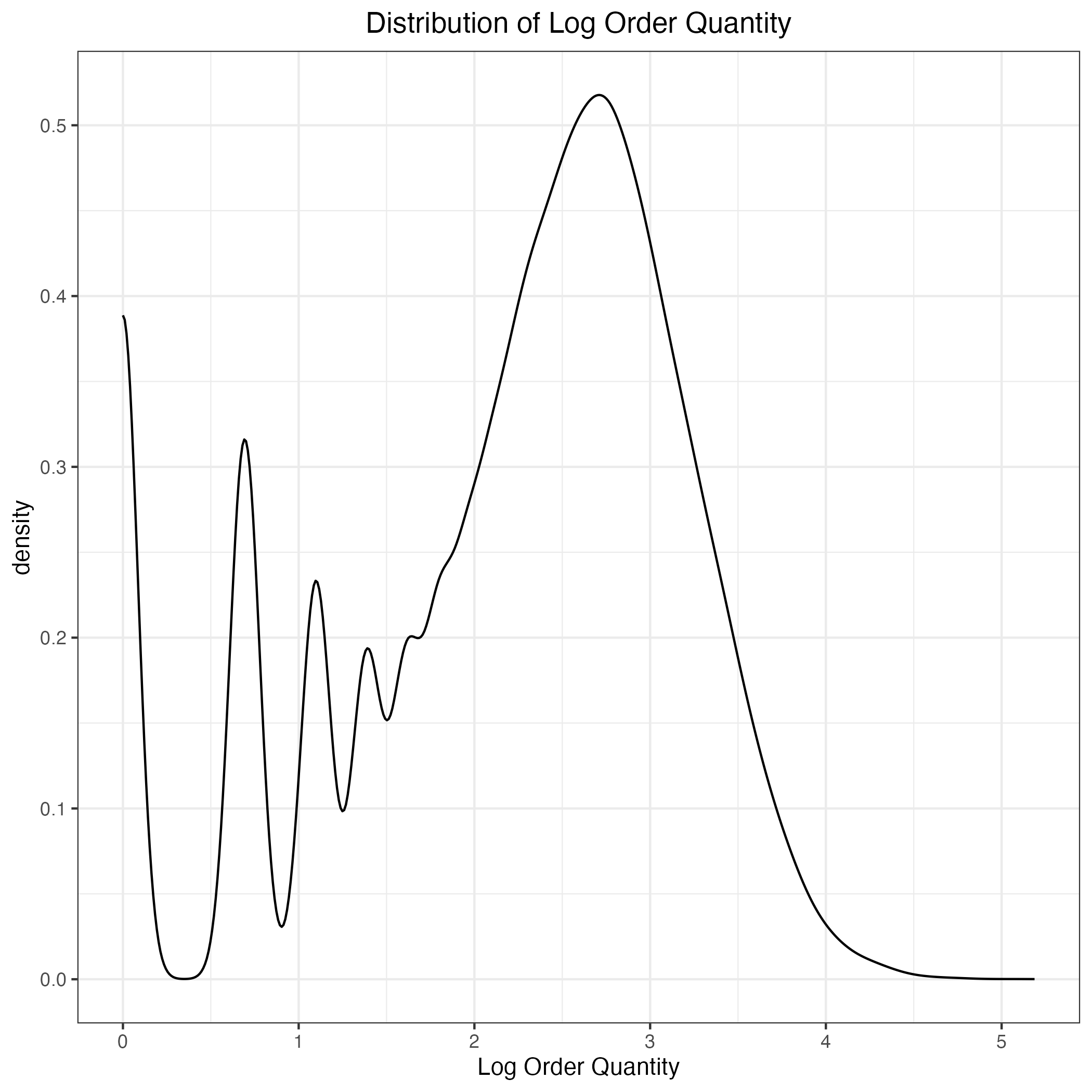
The log transformation seems to help normalize the distribution a bit, but it doesn’t seem great. We’ll also keep this for now. Finally, let’s look at the purchase variety.
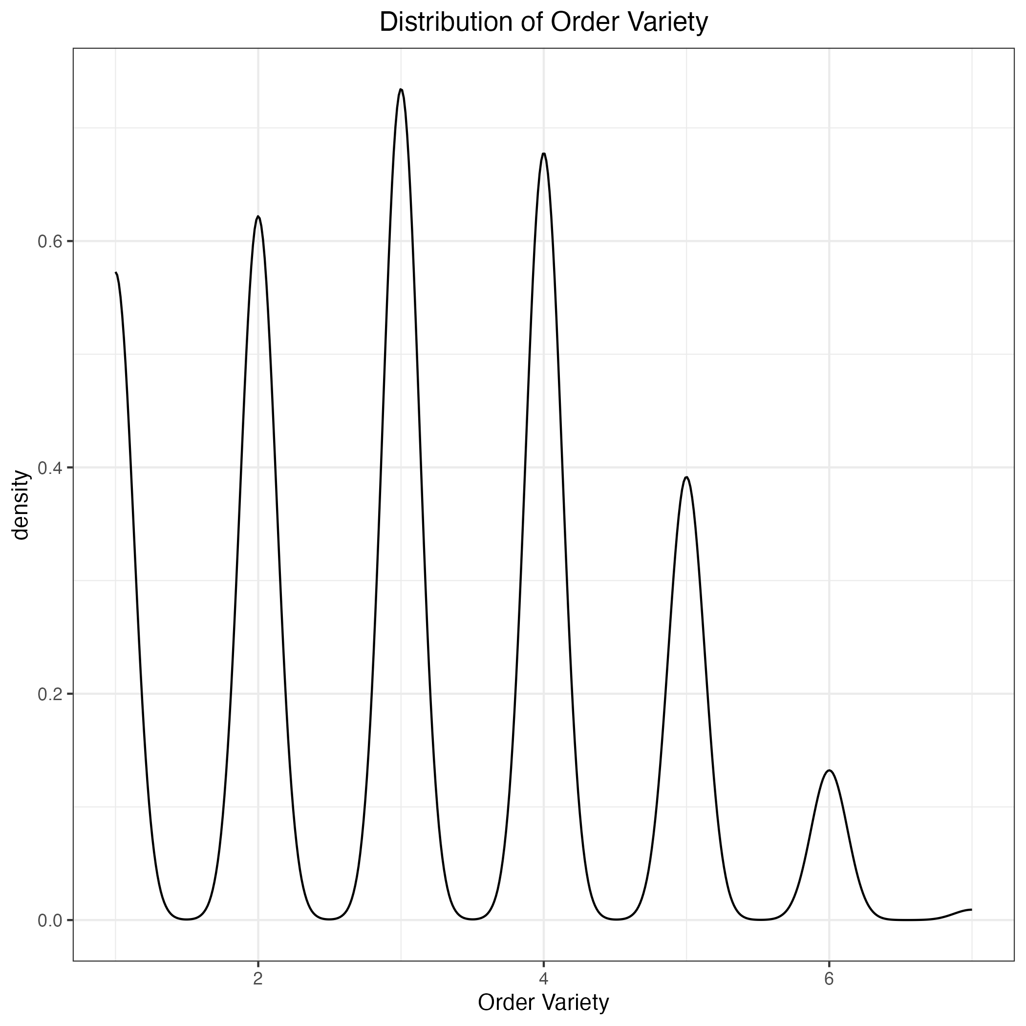
While this distribution looks a bit more normal, notice that peaks at each unit. This is because purchase variety has a range from one to six and it could be considered a multi-class categorical variable. For analysis purposes, I’ll treat it as a continuous variable since the analysis will be easier to interpret.
Having examined the outcome variables, let’s dive into some of the more exciting aspects of the data. First, I’ll explore the proportion of device types used by the customers in the data.
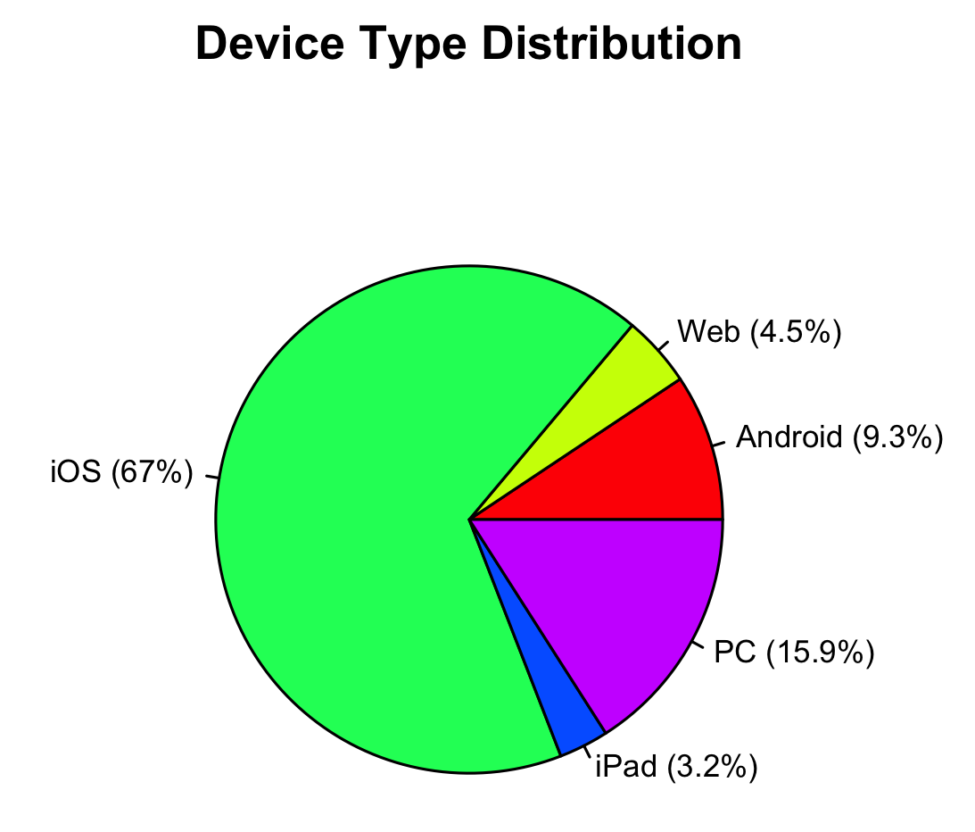
We can see from the pie chart that most shoppers in the data are buying groceries using their iPhones. Maybe that isn’t as surprising even in 2021. I should note here that the device type categories were defined by the data provider, so I have no control over their names or classifications. If you are wondering what the difference is between Web and laptop/PC, I had exactly the same question. My best guess is that the “Web” category represents shoppers who use a web browser to buy groceries that the company couldn’t classify into iOS or PC. Now that we know the distribution, how might this affect spending? One quick note: because the log-transformed order cost is harder to interpret, I’ll present the subsequent results in raw units.
| Device | Mean ($) | SD ($) |
|---|---|---|
| Android | 69.60 | 62.99 |
| Web | 51.39 | 56.96 |
| iOS | 78.96 | 66.72 |
| iPad | 82.74 | 70.67 |
| PC | 101.73 | 70.47 |
On average, customers who shop for groceries on their PC tend to spend the most. However, the interpretation of the average spending by device can be somewhat misleading because this method assumes each order as if it came from a unique user. To get a clearer picture, we should also calculate each user’s average spending by device and then aggregate these user-level averages. This approach accounts for individual differences in spending habits across devices.
| Device | Avg Spend Per User ($) | SD Spend Per User ($) |
|---|---|---|
| Android | 91.02 | 58.89 |
| Web | 67.52 | 57.64 |
| iOS | 96.30 | 59.70 |
| iPad | 103.85 | 63.93 |
| PC | 107.34 | 61.59 |
There doesn’t appear to be much of a difference in relational terms between the different device types for order cost. Next, let’s examine purchase quantity by device type using a similar approach.
| Device | Avg Quantity | SD Quantity |
|---|---|---|
| Android | 11.91 | 10.60 |
| Web | 8.43 | 9.31 |
| iOS | 12.80 | 10.64 |
| iPad | 13.86 | 11.30 |
| PC | 16.94 | 11.95 |
| Device | Avg Items | SD Items |
|---|---|---|
| Android | 15.47 | 10.33 |
| Web | 10.77 | 9.48 |
| iOS | 15.39 | 9.88 |
| iPad | 17.40 | 10.75 |
| PC | 17.88 | 11.14 |
Customers purchase the most items using a PC than the other devices which is unsurprising given that purchase amount and quantity are often highly correlated. Finally, let’s examine order variety.
| Device | Avg Variety | SD Variety |
|---|---|---|
| Android | 2.90 | 1.43 |
| Web | 2.34 | 1.36 |
| iOS | 3.02 | 1.43 |
| iPad | 3.05 | 1.44 |
| PC | 3.40 | 1.39 |
Order variety appears to be equal amongst the different devices. I won’t present the average user order variety results since they are quite similar to the table above.
Next, let’s examine the proportion of payment methods used by the customers in the data.
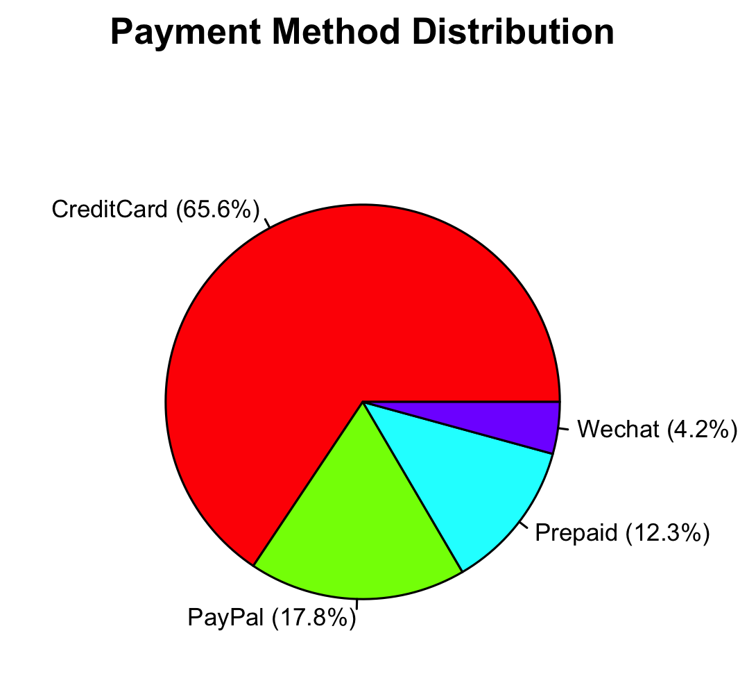
We can see that most shoppers pay by credit card, which maybe says something about it still being the most convenient form of payment. I should also note for those unfamiliar with “Wechat” that it is a social networking app with an integrated digital wallet. Keeping this in mind, let’s look at the average order cost and average user order cost.
| Payment Method | Avg Order Cost ($) | SD Order Cost ($) |
|---|---|---|
| CreditCard | 80.37 | 66.22 |
| PayPal | 84.10 | 65.06 |
| Prepaid | 67.74 | 73.94 |
| 106.42 | 71.62 |
| Payment Method | Avg User Order Cost ($) | SD User Order Cost ($) |
|---|---|---|
| CreditCard | 97.06 | 59.01 |
| PayPal | 94.98 | 57.33 |
| Prepaid | 97.20 | 71.06 |
| 104.79 | 66.77 |
Looking at both tables, we can first identify that Wechat payment has the highest average spending per order, followed by that of credit cards, and then prepaid balances. However, at the user-level, Wechat payment still remains the highest but the average spending by prepaid balances is equal to that of credit cards. This shift seems confusing. Why might this be the case?
Well, a really cool explanation of this could be the Simpson’s Paradox or the Aggregation Effect. This refers to a phenomenon in which aggregating data ta a higher level shows one result, but aggregating at a sub-level shows another. In this case, certain customers may spend a lot using credit cards, inflating the overall average. But when we calculate user-level averages, these high-cost orders are “flattened” by other customers with lower spending on credit card orders (remember credit card payments represent the highest proportion of payments). In contrast, prepaid balance customers may have fewer total orders, but their spending per order is more consistent, leading to a higher user-level average.
For order quantity and order variety, I’ll focus on user-level results rather than order-level averages. Since payment methods for groceries tend to be habitual, user-level differences should provide a more meaningful interpretation.
| Payment Method | Avg User Order Quantity | SD User Order Quantity |
|---|---|---|
| CreditCard | 15.90 | 10.20 |
| PayPal | 15.13 | 9.79 |
| Prepaid | 15.82 | 11.40 |
| 16.01 | 10.18 |
| Payment Method | Avg User Order Variety | SD User Order Variety |
|---|---|---|
| CreditCard | 3.34 | 1.25 |
| PayPal | 3.24 | 1.27 |
| Prepaid | 3.35 | 1.20 |
| 3.39 | 1.29 |
As expected, Wechat payment customers seem to purchase the most quantity and variety compared to the other payment methods.
Let’s quickly look at the proportion of customer membership.
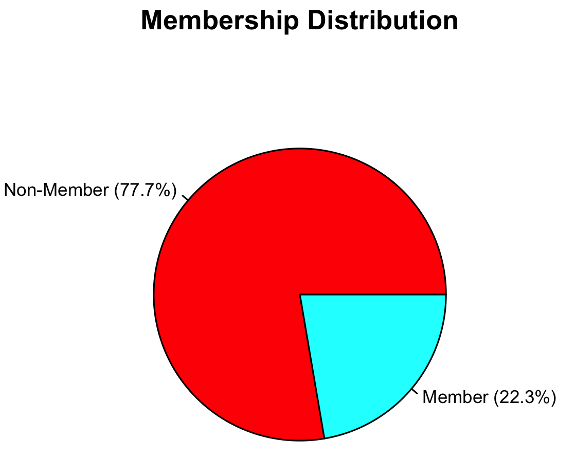
Most customers in the data set appear to be non-members, which isn’t really surprising. We’ll look at some descriptive means of the three outcome variables below.
| Membership Status | Avg Order Cost | SD Order Cost | Avg Order Quantity | SD Order Quantity | Avg Order Variety | SD Order Variety |
|---|---|---|---|---|---|---|
| Non-member | 83.54 | 65.58 | 13.75 | 10.90 | 3.10 | 1.44 |
| Member | 70.31 | 73.41 | 11.34 | 11.08 | 2.85 | 1.42 |
The means demonstrate that non-members spend more, purchase more items, and have greater product variety than members. This was unexpected, but it could be due to the larger number of non-members compared to members in the data set. I wonder if this pattern holds true for other online grocery stores or even for retailers (e.g. Amazon, BestBuy, Nike, etc…)?
Last but not least, let’s examine the distribution of region.
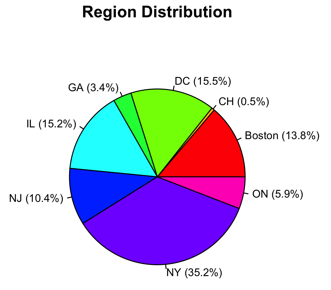
As mentioned before, the data comes from an online grocery store that services mainly the East Coast region of the U.S. As you can see, the majority of its customers are from the East Coast regions such as New York state (35.2%), the Washington D.C. area (15.5%), Illinois (15.2%), Boston/Massachusetts (13.8%), and New Jersey (10.4%).
Okay, we finished learning about our variables. Let’s move onto the results! Part 2